By Jared @ Floormatstore.com
The other day, a friend called me up to discuss safety codes in regards to stairs. He was moving his son out of his apartment and carrying the sofa down the stairs. The rubber stair treads were in terrible shape, cracked, worn through and just in general need of replacement, which of course presents a safety issue on its own. The larger issue he had called about though, was stairway visibility. The stair treads had grit stripping in the nosing – which is a sandpaper-like tape, used for extra traction and visual awareness – on all but a few of the steps, one of which was the last step before a landing. Walking down the stairs backwards, carrying one end of the sofa, the bottom step – missing the strip – blended in with the landing below it, giving the false impression that he had reached the landing. As you could guess, stepping back, thinking that he had reached the landing, caused a bit of a stumble. I’m sure we have all experienced that moment of terror, where your heart jumps up an inch, your stomach is sucked up into your chest and your breath stops for a split second that feels like minutes. Luckily for him, he caught himself before fully falling down and walked away without injury. His story made for a great discussion on the topic of contrasting color for visual awareness.
One of the highest causes for accidents on stairways is poor visibility of both risers and treads. Poor visibility can cause people to misread the edge of a step, causing them to fall. One of the best and most cost effective ways to increase visibility is by providing a visual contrast on the leading edge of treads. According to the U.S. Access Board Research, safety yellow is the most ‘visually detectible’ color.
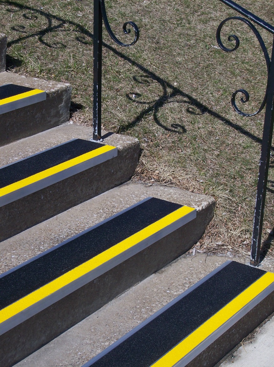
FloorMat-Store.com GSA9 Aluminum Stair Treads displaying a black tread with contrasting safety yellow leading edge
Whether or not the contrasting stripes are a requirement is a debated topic across the country. Because stairs are not part of an accessible route, ‘ANSI A117.1 Section 504 Stairways’ does not technically apply to the IBC. The misconception comes from the commentary for subsection 1102.1 Design. Visual contrast is not referenced into the IBC, so it only applies if the authority having jurisdiction has specifically incorporated the requirement into their set of codes. For example, all of California does require them. Also, according to ADASAD Advisory 504.4 Tread Surface, the contrasting color is not required, but strongly suggested. If you are unsure of the requirements in your area, check with your local building inspector.